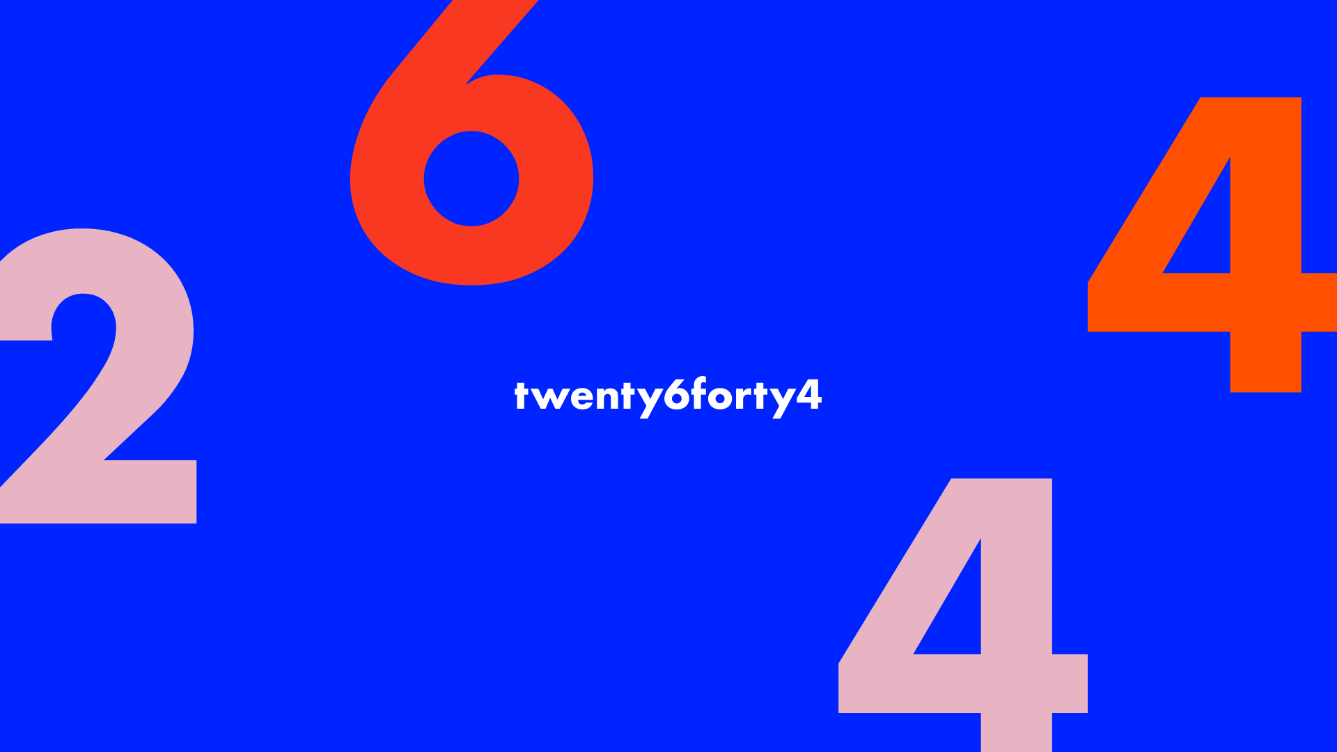
Twenty6Forty4 came to me with a goal to achieve a bold and punchy brand. The name Twenty6forty4 comes from the 26 letters of the English alphabet and 44 sounds of the English language. Highly experienced, energetic and enthusiastic Twenty6forty4 believes that effective communications sits at the heart of every successful business. Public relations, social media support, marketing communications, Leadership training and coaching are just some of the services Twenty6forty4 offer.
This team is incredible and they needed a brand that could carry that credibility and professionalism through years of business.
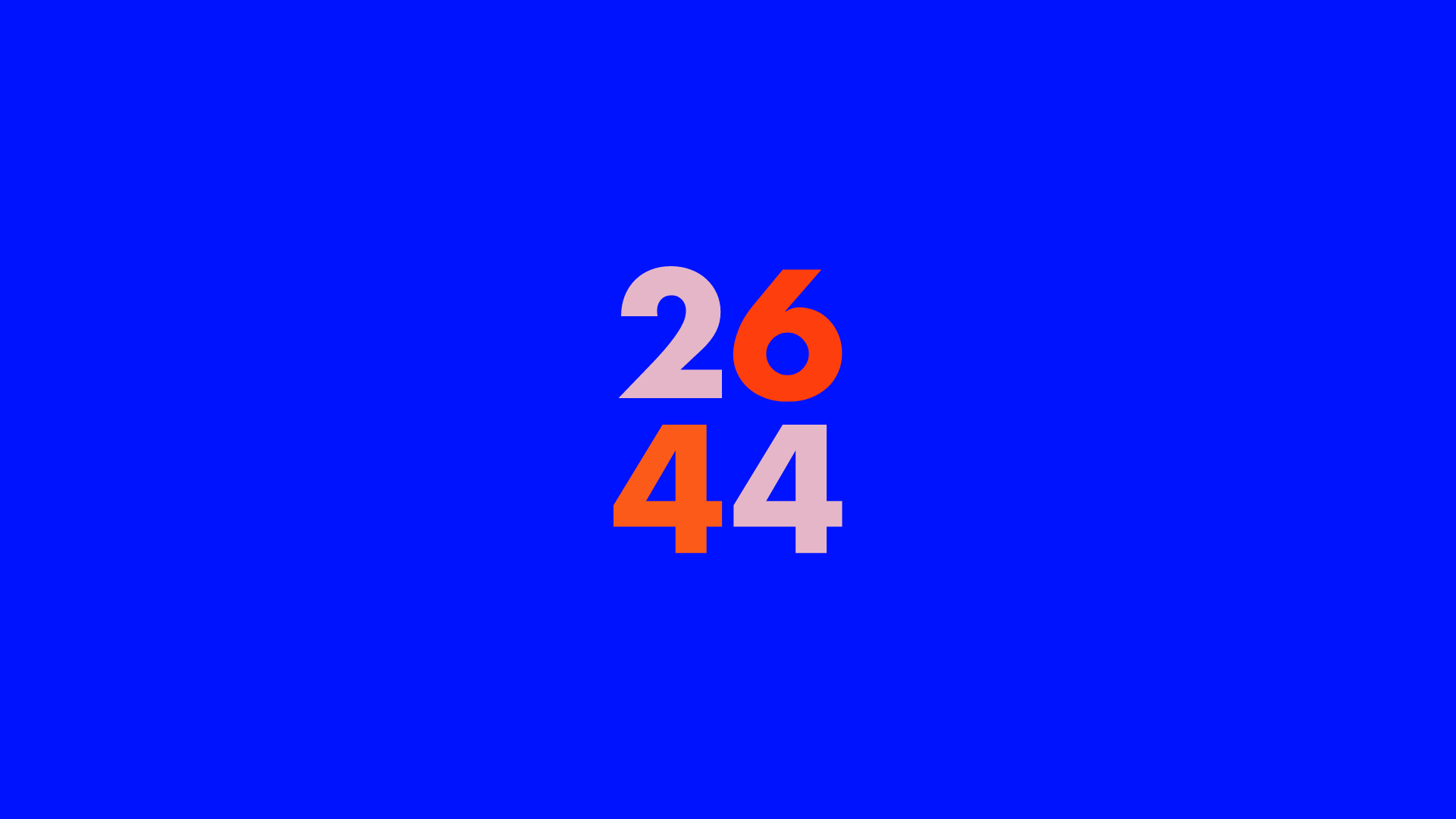
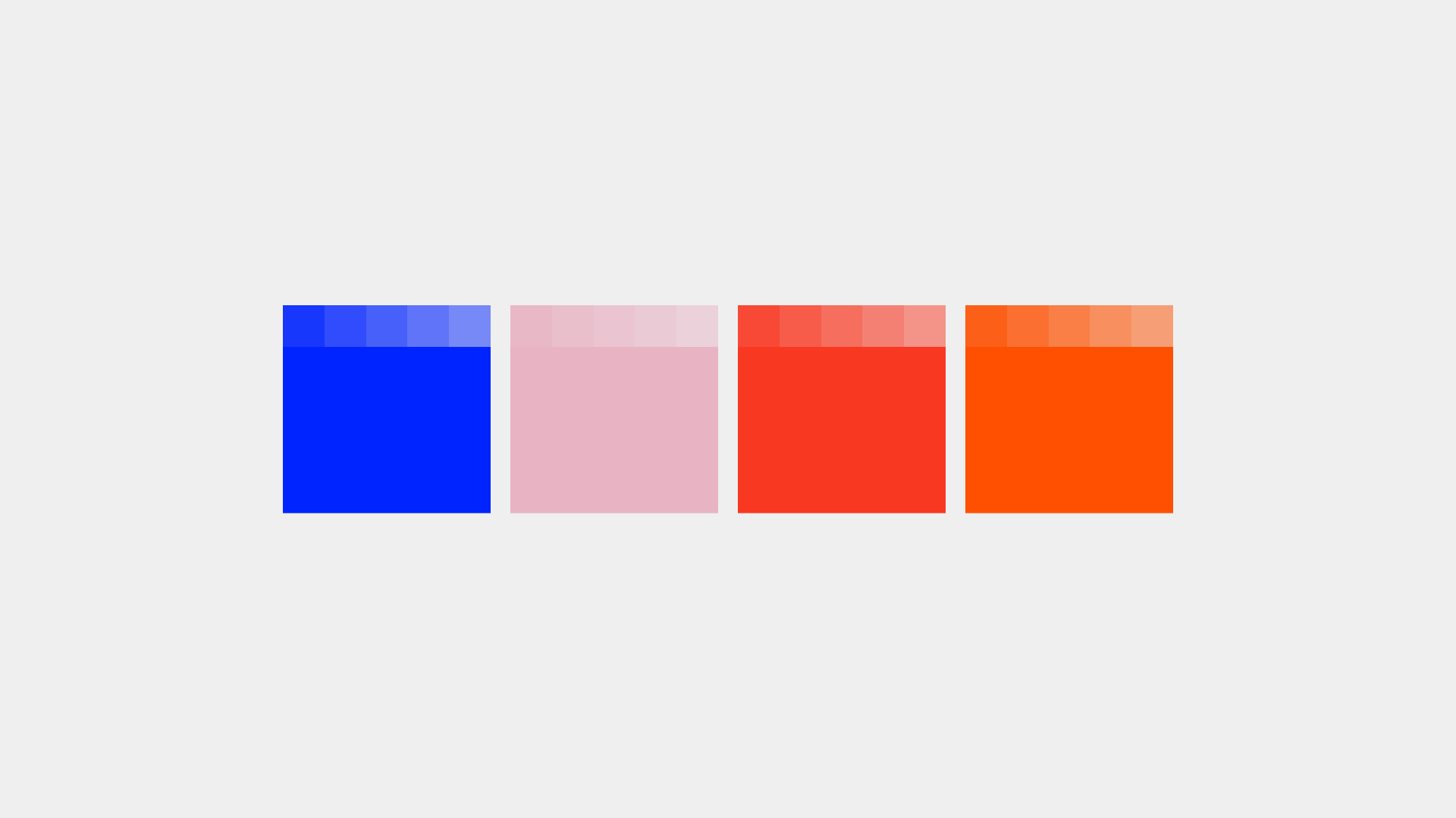
So we decided on this bold colour palette which consists of electric blue, neon orange, red and a baby pink to soften the overall design. I then paired these insane colours with bold type to make it even punchier. This is one of my favourite projects yet, I just love the feel this brand gives off and happy I could bring that to the table for the client.
Project Details
Brand Development
Logo Design
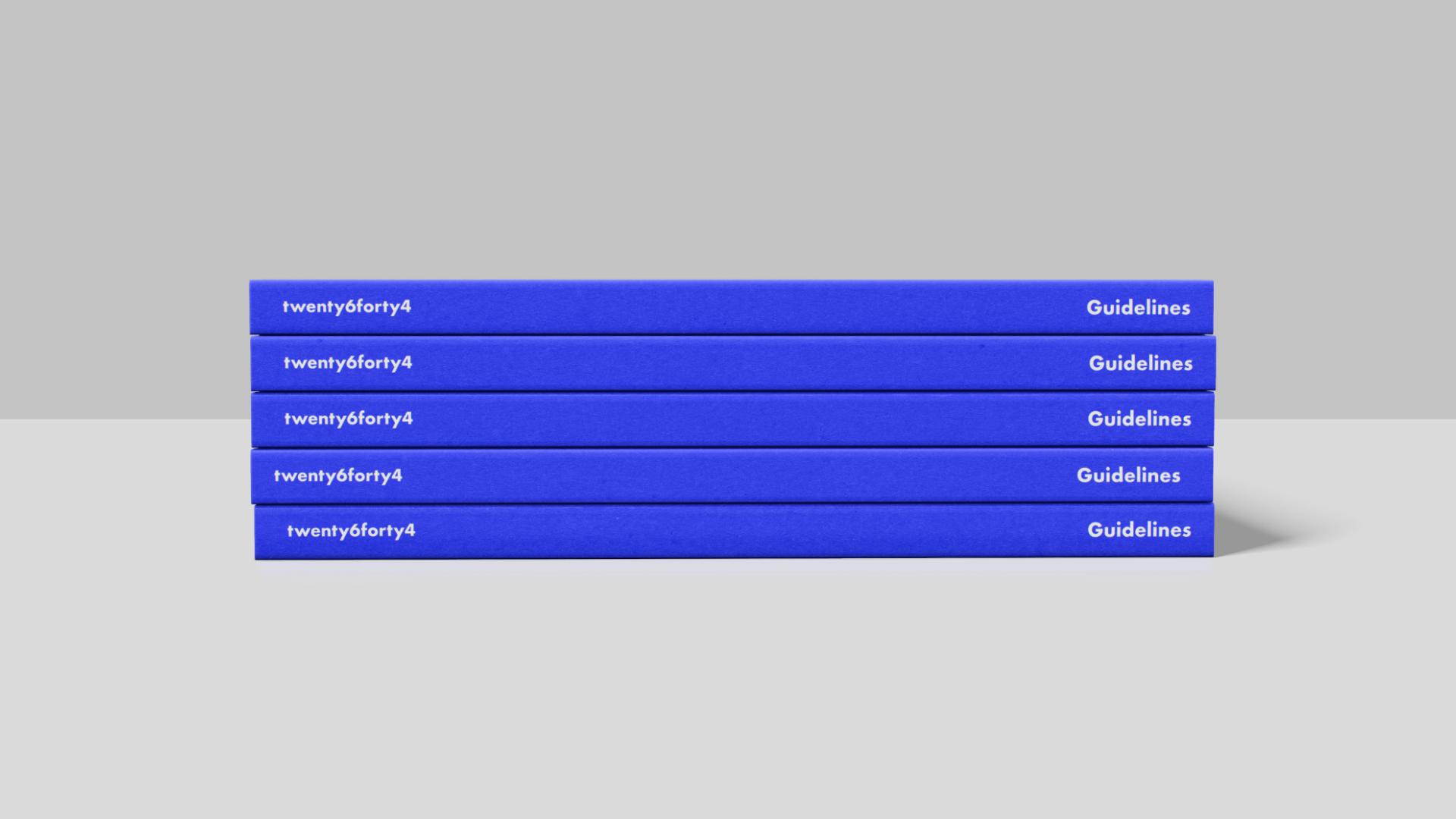
Brand Guidelines
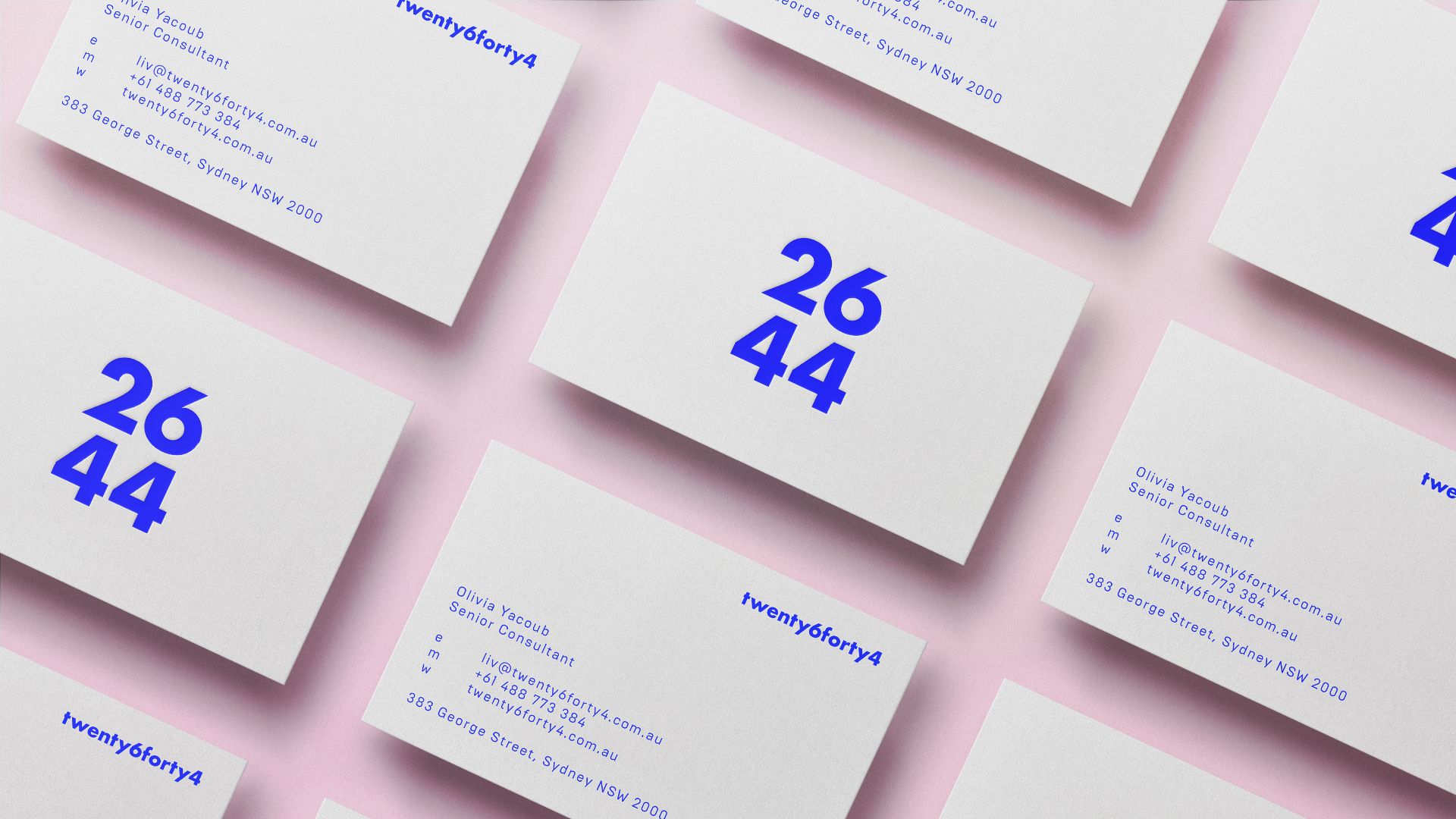
Business Card Design
